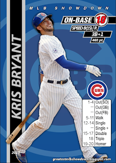
Bob had a really fun idea and I had some spare minutes to plug in the background, so check out the 2017 Kris Bryant card in IVY form! What would you think about this background being used for the Cubs in 2018? Too busy or iconic? Do you prefer unique teams/players, or do you like uniformity? What other teams would you like to see done in a special "ballpark" style? Hope you enjoy this gem regardless!


That’s a pretty cool look. I really like uniformity when making a full team set, even when you do the fools different it still fits the team. But for individual players I like different looks and logos. Like if you were doing 5 cubs greats or something like that with the ivy as the background I think that would be cool. First thing that came to mind for me was like for Boston having the background being a shot of the green monster
ReplyDeleteI Agree that it might be too much for an entire team set but they look super cool and definitely should be used for more unique sets
ReplyDeleteYou guys should do the all century team, could be super cool and use these types of designs for it
ReplyDeleteThis is a really, really fun idea! Definitely a special idea we're going to develop carefully, but I'm a big time fan of this suggestion!
Delete